The Console (Orion UI)
Orion itself is API-first — everything in these docs is plain HTTP. Orion UI is the operations console on top of that API: live dashboards, a system map of every channel → workflow → connector, workflow logic visualization, trace drill-downs, and a data console for firing test requests. Everything the admin API can do, point-and-click.
Zero to a live service — no code
The full creation loop in under a minute: import a workflow (paste → validate → dry-run → activate), watch its logic render as a graph, give it an endpoint with the channel form, send a request from the Data Console, and see the service on the System Map.
Run it
The UI ships as a production-ready container image (nginx, multi-arch):
docker run -p 8081:8080 \
  -e ORION_URL=http://host.docker.internal:8080 \
  ghcr.io/goplasmatic/orion-ui:latest
Open http://localhost:8081 — ORION_URL points at your Orion server and the bundled
nginx reverse-proxies all /api/ requests to it. Developing against a local checkout?
npm install && npm run dev in the Orion-ui repo
does the same via the Vite dev server. A docker-compose.yml that brings up server + UI
together is in that repo as well.
What you get
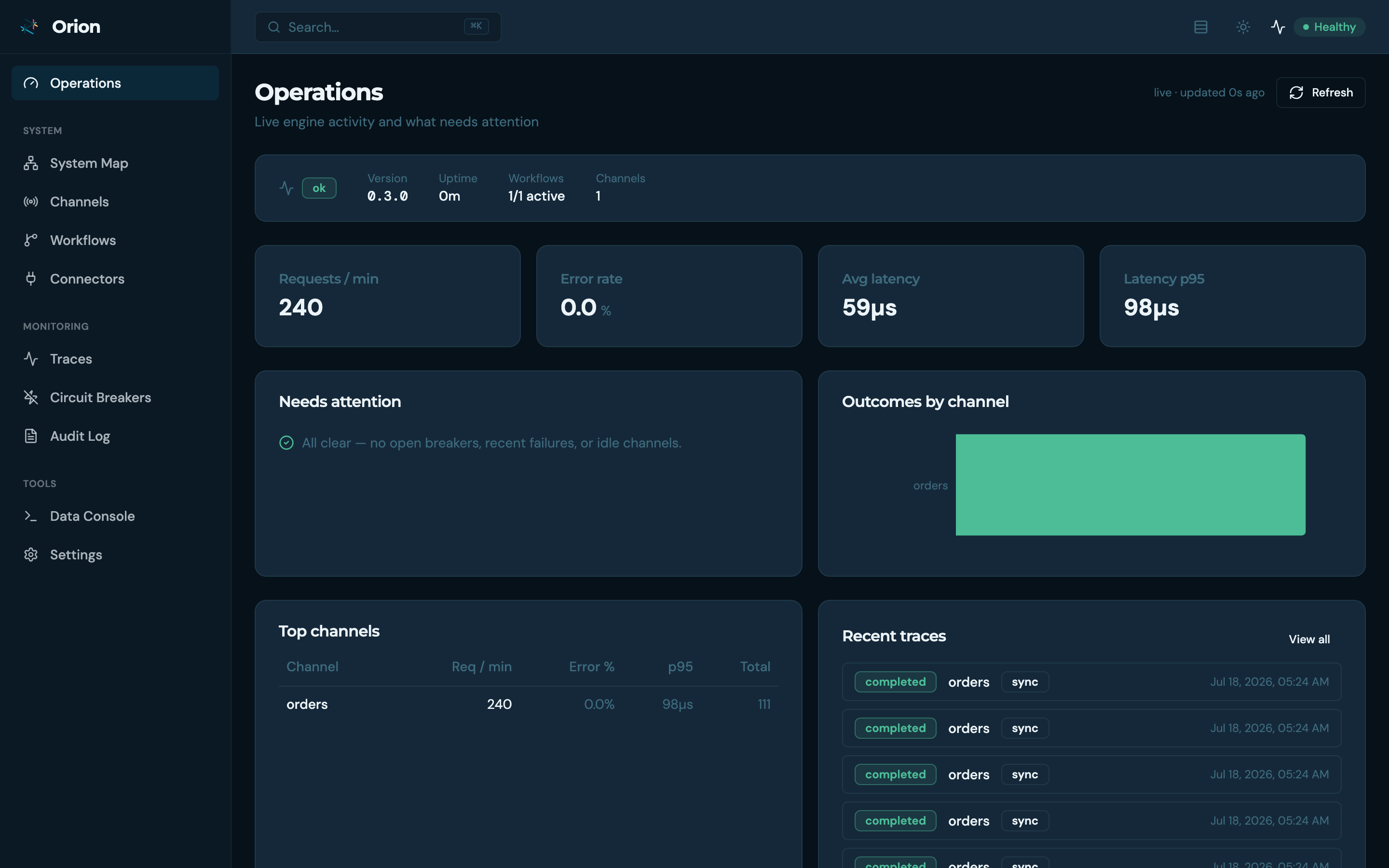
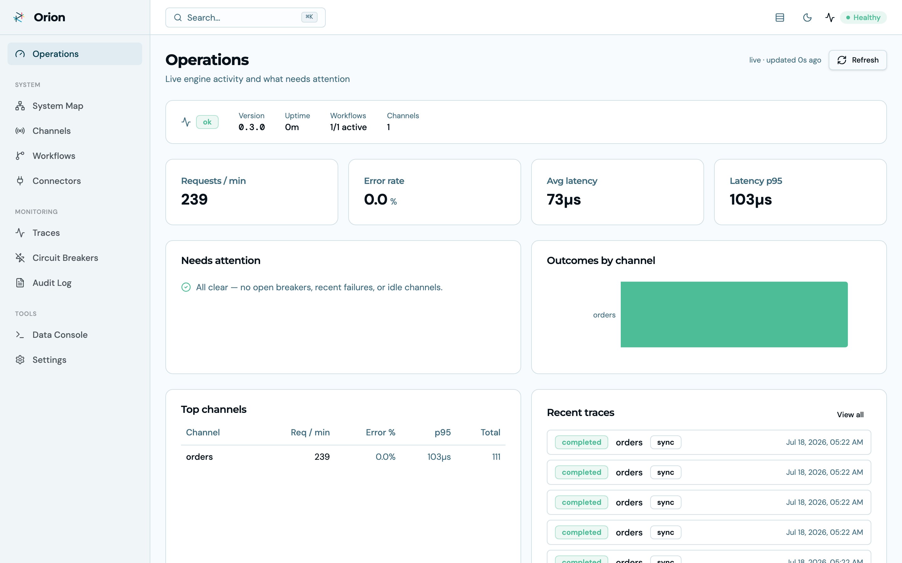
Operations dashboard
Live request rate, error rate, latency percentiles, outcomes by channel, top channels, recent traces, and anything that needs attention (open circuit breakers, idle channels, recent failures) — for the whole instance, at a glance.
System Map
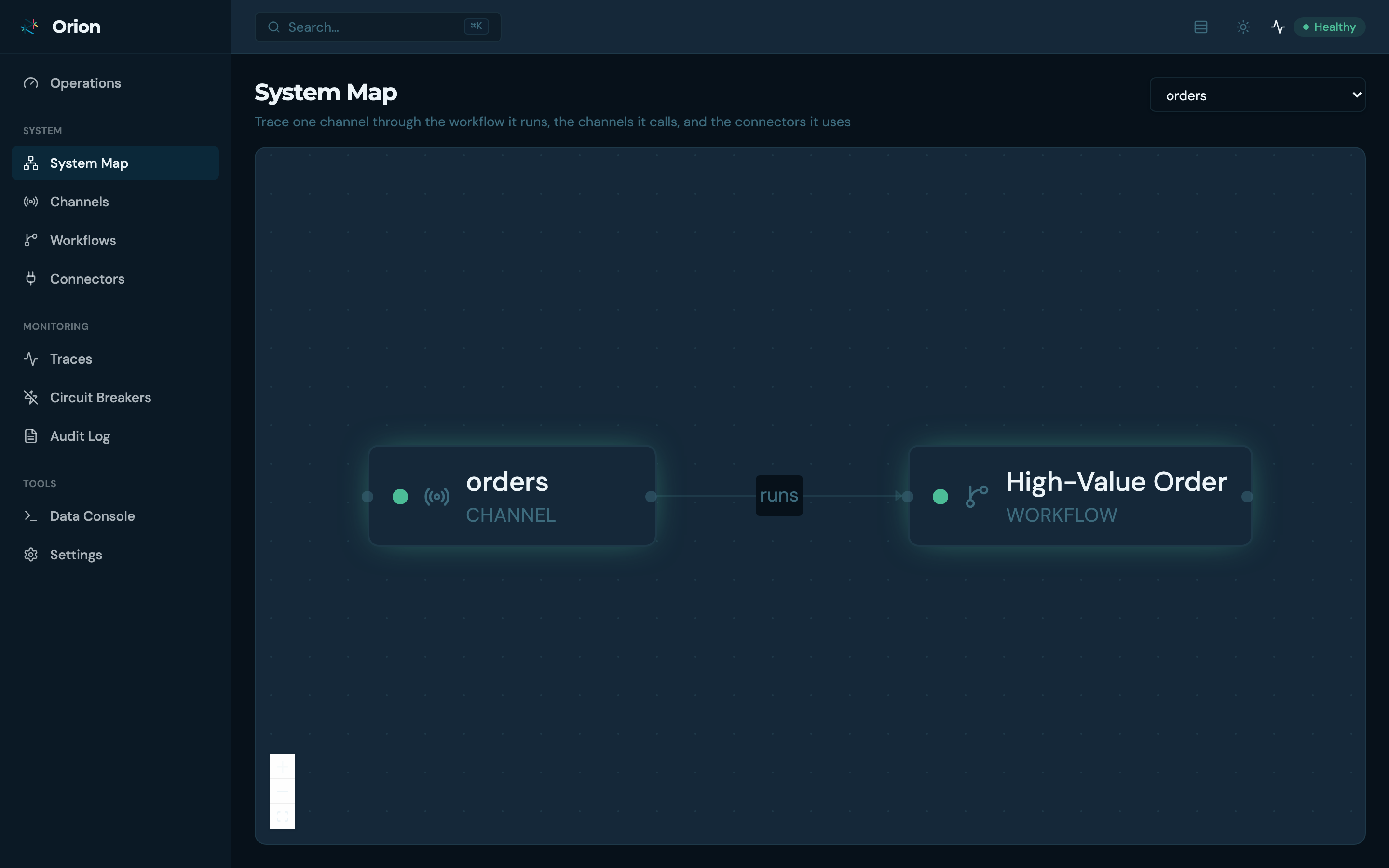
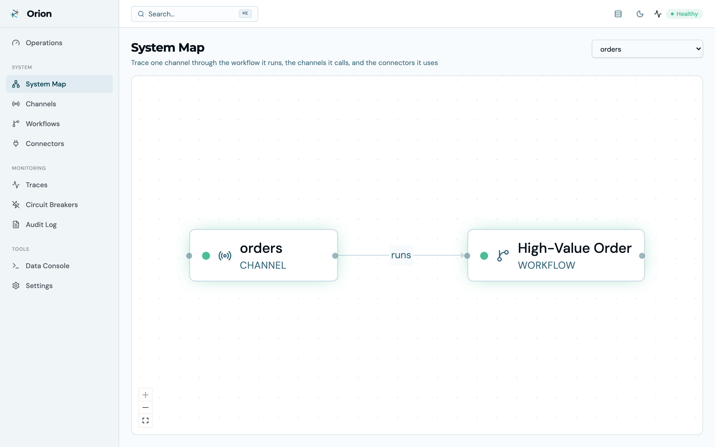
Pick any channel and trace it through the workflow it runs, the channels it calls in-process, and the connectors it touches — as a live topology graph. Every node links to its detail page.
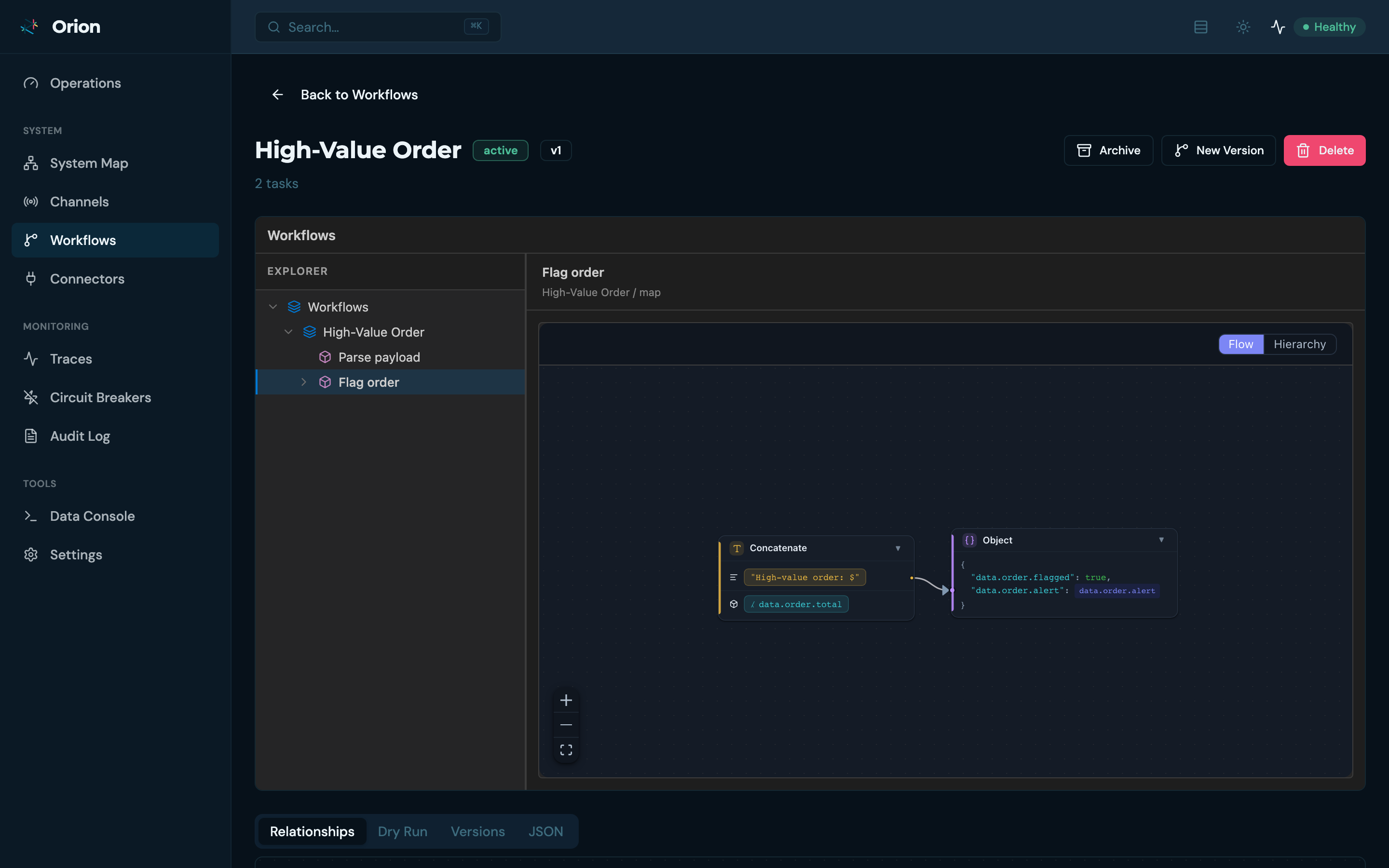
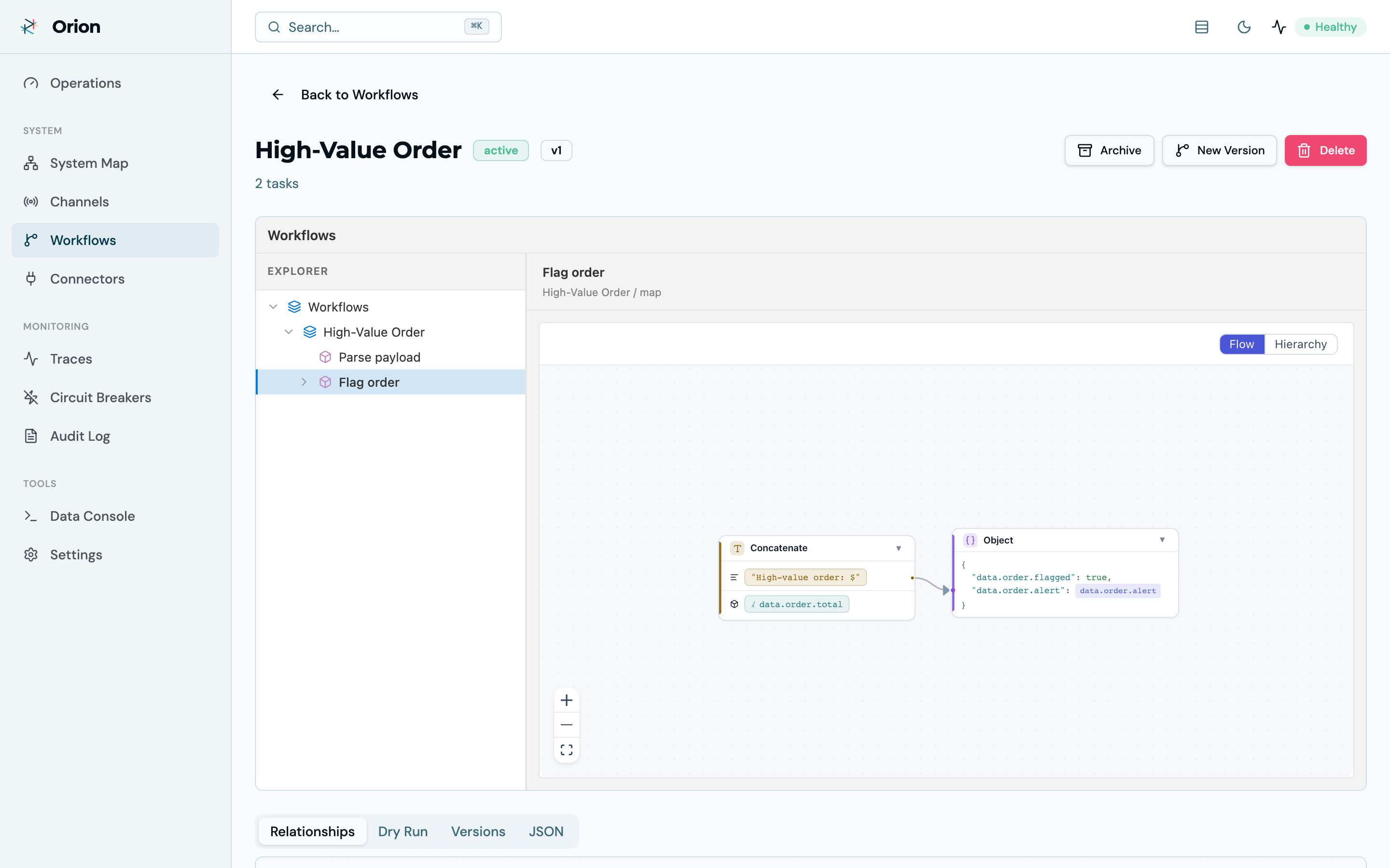
Workflow logic, visualized
Workflows are managed through a guided import wizard — paste JSON (often AI-generated), validate it, import as a draft, dry-run it against a sample payload, then activate. On the detail page, each task’s JSONLogic renders as a flow graph, with tabs for relationships, dry-run testing, version history, and the raw JSON.
Data Console
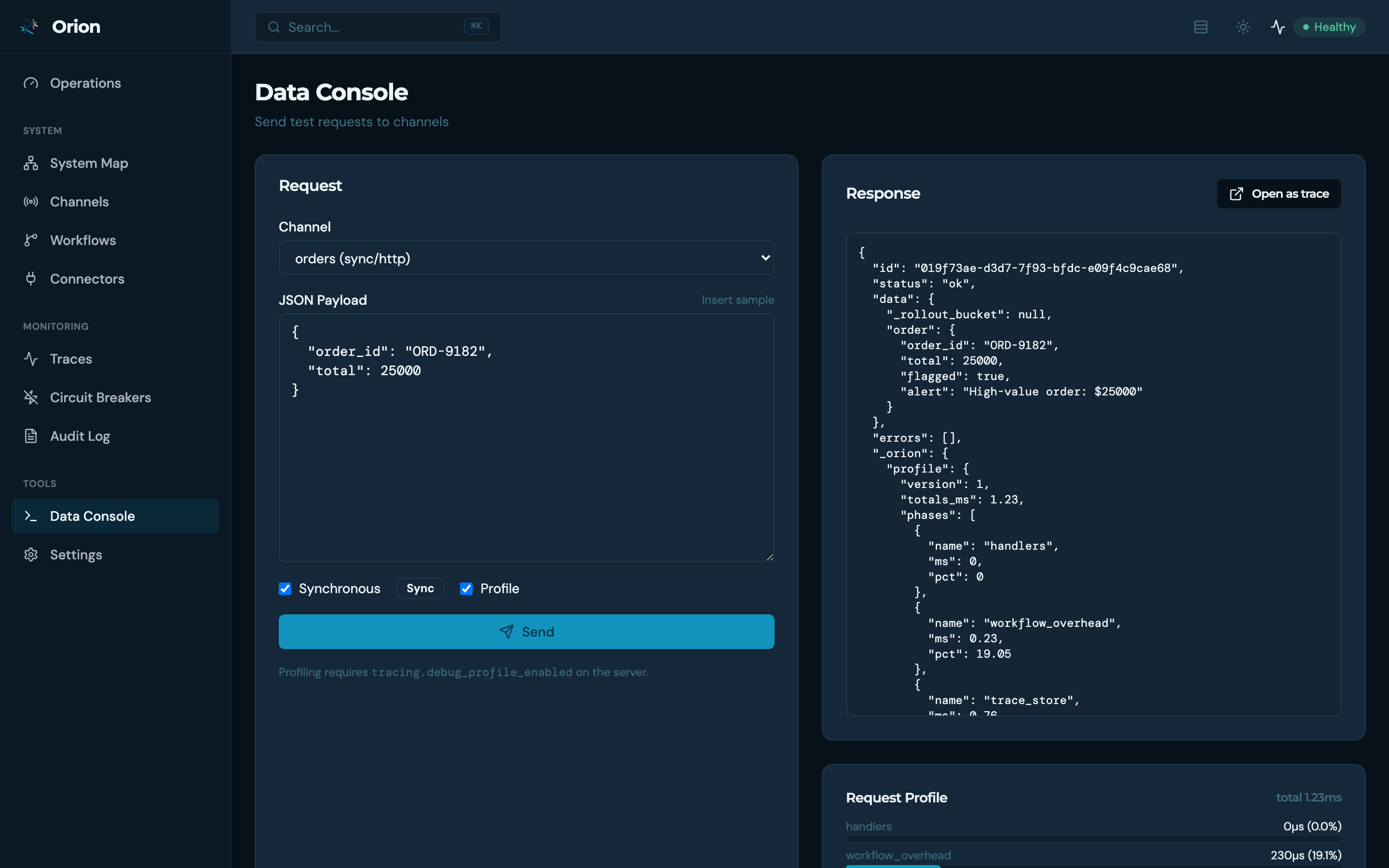
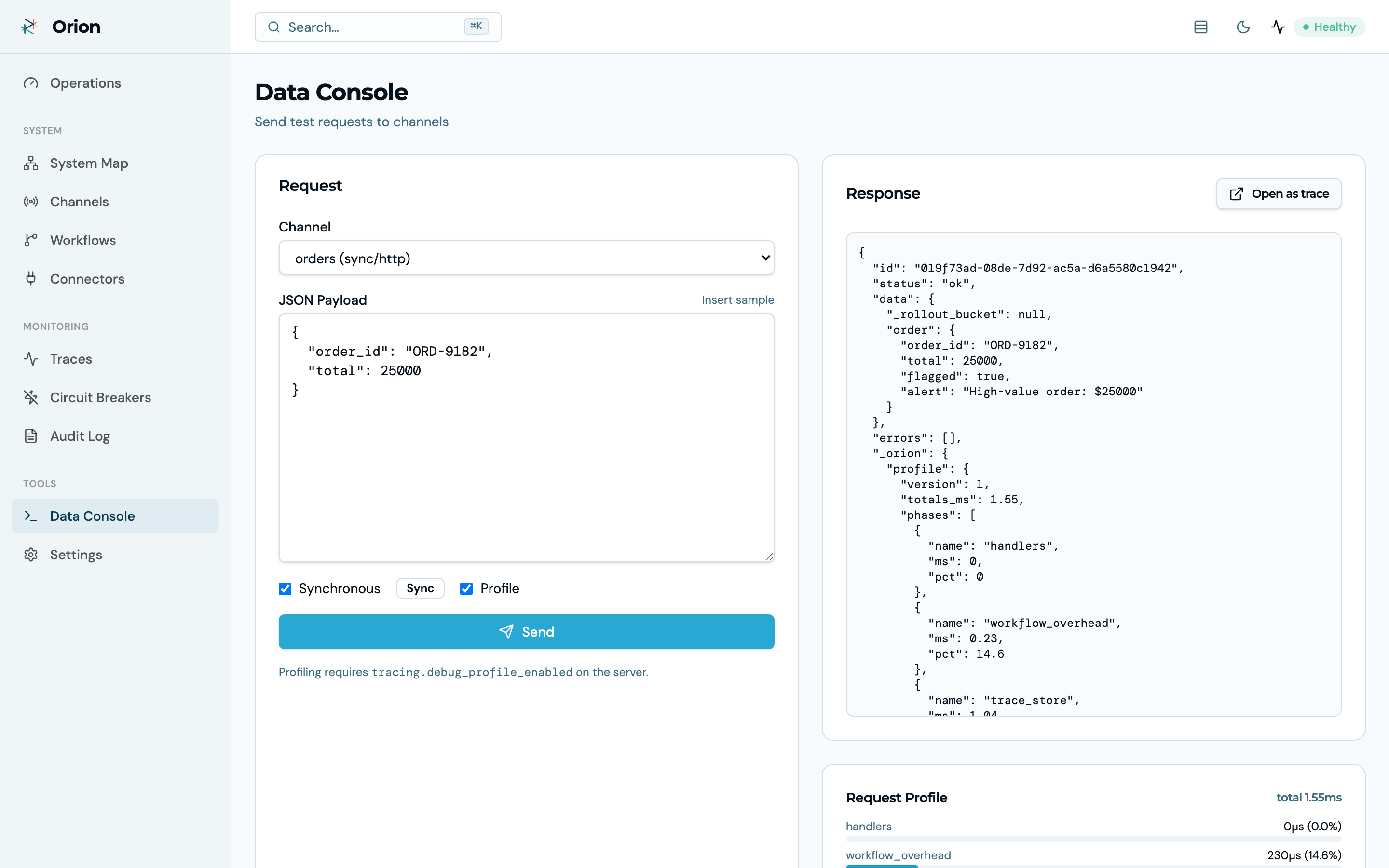
Send test requests to any channel — sync or async, with optional per-task profiling — and inspect the response, the request profile (per-function and per-connector timings), and the resulting trace, one click away.
Also in the console: channel and connector management with lifecycle actions (draft → active → archived), circuit-breaker monitoring and reset, the audit log, trace search and drill-down, and a command palette (⌘K) for jumping anywhere.
All visuals on this page are generated from a live instance by the recording pipeline — re-run
record-ui.shand they regenerate.